Table of Contents
Introduction
The Custom Look module is part of the Adroit Custom bundle.
This module provides a range of options for customizing the appearance of your custom interface.
Global and Local Looks
If a patch doesn’t contain a Custom Look module then your custom interface will have the same settings for fonts, colors and so on as the last Adroit Custom patch you ran. These settings are called the “global look”.
When you add a Custom Look module to a patch, the Custom Look module is automatically intialized to the global look so nothing changes immediately. You can then modify the settings and remove the Custom Look module if you wish. What you have done is modify the global look, so when you load another patch it will have this new global look too.
This is absolutely fine much of the time but what if you want a particular patch to remember its own particular settings? In other words to have its own “local look”.
To have a local look you simply leave a Custom Look module in the patch. Then when you reload the patch, instead of the Custom Look module initializing to the global look, it remembers the look that was local to this particular patch last time and automatically overwrites the settings of the global look.
The problem then is that patches that don’t include a Custom Look module have unpredictable appearances (which was the case before too, but only once the look begins changing automatically do you notice the issue). This is something that you can ignore when starting out but once you begin refining things and using customized background images then you’ll want to take more control.
For this reason it’s recommened that any “production quality” project using Adroit Custom contains a Custom Look module hidden away in a cabinet at the bottom of the patch.
This recommendation will probably go against your instincts as you might feel it’s inefficient to leave a module as huge as Custom Look in a patch. Custom Look also eats up CPU and GPU when you twiddle its controls so you’ll no doubt think by not having it in a patch you’ll save on these precious resources. But when Custom Look is lying dormant and out of sight it has practically zero impact on a patch. So don’t worry about its presence being inefficient because it isn’t. Technically, its ProcessSample method (the code that gets called for each sample) does precisely nothing.
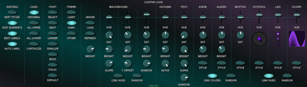
Editing Section
On the far-left of the Custom Look module there are a number of buttons that give you control over what can and can’t be edited in your custom interface. They provide a mechanism for protecting your work from accidental changes when you are not in the process of editing.
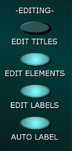
The EDIT TITLES button controls the status of the title area at the top of Custom Panel modules.
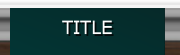
When the EDIT TITLES button is disengaged the top part of Custom Panel modules behave just like the tops of regular Voltage Modular modules, but when the button is engaged they turn into text fields that you can edit with a double-click.
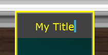
If you are ever mysteriously unable to drag Custom Panel modules around it will be because the EDIT TITLES button is engaged.
When the EDIT ELEMENTS button is engaged a right-click on a blank part of a Custom Panel module or one of its elements will pop-up an editing menu. When EDIT ELEMENTS is disengaged the right-click menus are disabled – making it impossible to accidentally add, remove or modify elements.
If the right-click editing menus on Custom Panels do not appear it will be because the EDIT ELEMENTS button is disengaged.
When the EDIT LABELS button is engaged labels can be edited by double-clicking on them. When it’s disengaged labels are protected from accidental change.
When the AUTO LABEL button is engaged the labels of controls on Custom Panels are automatically labelled when they are mapped. This is generally very useful but if you’ve already labelled things then you might want to disable this feature. Note that, if enabled, auto-labelling still works even when EDIT LABELS is disengaged.
Case Section
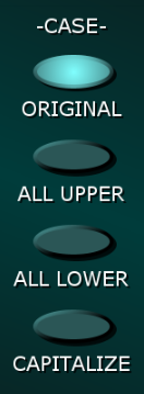
The CASE buttons allow you to switch all labels between different types of letter case. This can help unify the look of your custom interface and it also gives you the chance to try out different cases for artistic reasons without you having to laboriously edit dozens of labels.
Fonts
The FONT section lets you specify the font used for all the labels in your custom interface.

Click on the SELECT button to pop-up a large menu of all the fonts installed on your computer. On a WIndows machine this might look something like this…
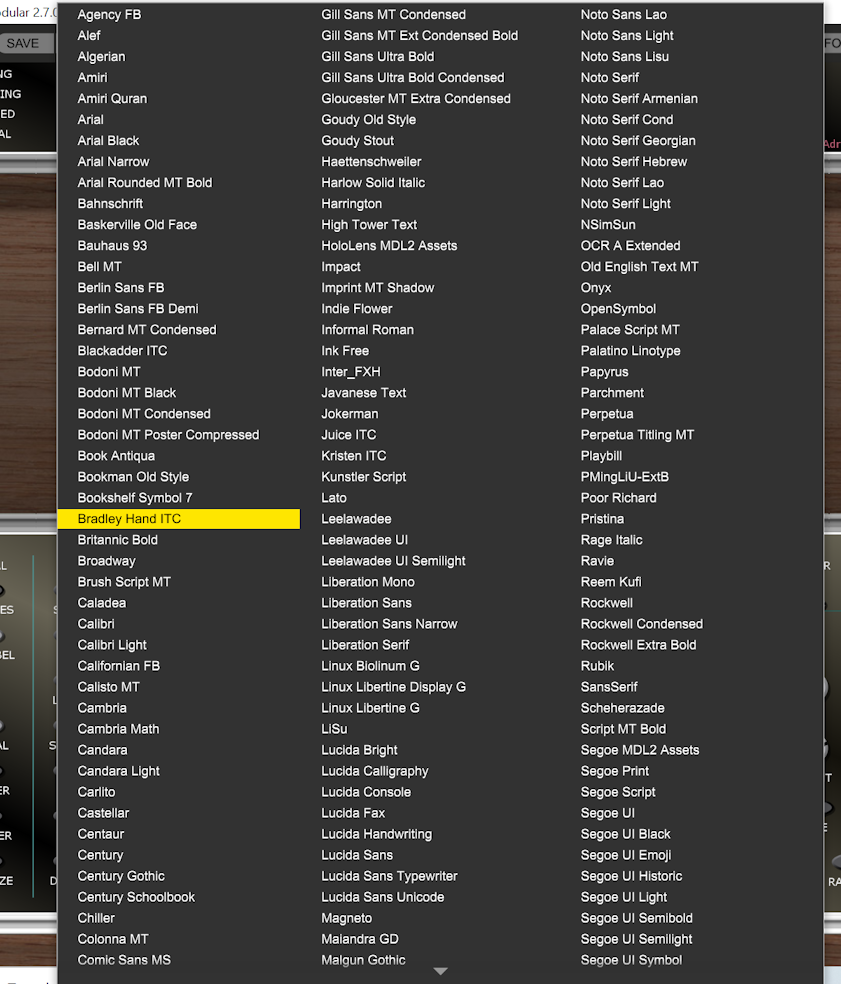
There are a lot of choices but many of the fonts look surprisingly similar. Note that the choice of fonts available on an Apple computer will be different.
As with so many thing Apple and Microsoft fail to agree on which fonts to include with their operating systems, so unfortunately there are only a limited number that are guaranteed to be available on both.
If you want to ensure that your projects looks exactly the same across platforms then you’ll either need to download and install the same font on both machines or limit yourself to those that are common. Unfortunately these are mostly rather boring fonts like Arial, Courier New, Times New Roman and Verdana.
Fonts can have a lot of impact on how your interface looks. Some distinctive looking ones are Bradley Hand ITC, Chiller, Comic Sans MS, Indie Flower, Ink Free, Jokerman, Michroma, Mistral, MV Boli, Newest Shape, OCR A Extended, Papyrus, Serge Print, Tempus Sans ITC but the list is almost endless and very much a matter of personal taste. Some people love quirky fonts while others hate them. New fonts seem to pop up almost every week so it’s an interesting field to explore.
If you are happy to download and install fonts then you will have much greater artistic freedom. Google “free fonts” and “installing a font” for help. In practice it’s extremely easy to install a font so don’t be put off. The two main file formats are TrueType and OpenType and both work fine.
In the menu the currently selected font has a tick next to it. To quickly select the next font in the order click on the NEXT button.
The LARGER and SMALLER buttons do what you would expect. Beware that it’s easy to get carried away using large font sizes but in practice there is imited space available. Labels overflowing their areas is a problem that’s only really solved by trial and error. Something that works fine in uppercase can overflow in lowercase and so on.
The BOLD and ITALIC buttons generally do what you would expect although some fonts may be unaffected by their settings.
The DEFAULT button resets all the font parameters. Specifically it selects a mid-range point size Verdana (which is available on both Windows and Mac) with bold and italics switched off.
It’s recommended that you use the DEFAULT font setting as a reference for how long your label text can be. If all your labels work with the default font setting then your interface will always be portable.
Should you load a font that doesn’t work it’ll mess up the labels on Custom Look. You can easily restore things by doing an undo.
Themes
Your choices are organized into three different themes called Light, Dark and Other. You can switch between themes by clicking on the LIGHT, DARK and OTHER buttons in Custom Look.

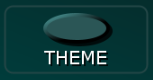
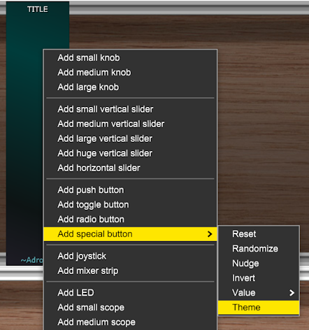
You also have the option of adding a special Theme push button to a Custom Panel module that cycles between the themes when clicked.
Use the Custom Panel Main Menu Add special button option to do this…
You might choose the Light theme to have a bright background, white knobs and black text labels; the Dark theme to have a dark background, black knobs and vivid green text labels and the Other theme to be something rather quirky. It’s completely up to you.
The columns of buttons on the left of the Custom Look module apply in all themes while everything to the right of the -THEME- column changes depending on which theme is currently selected.
You don’t have to use different themes of course. You might want to just use the dark theme all of the time.
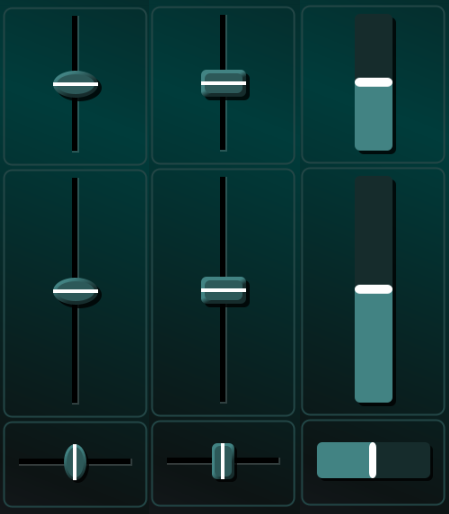
Hue, Saturation and Brightness
Adroit Custom uses a color model called Hue, Saturation, Brightness (HSB). You may be more familiar with the Red, Green, Blue model but HSB is generally easier to use once you are familiar with it. It’s why it’s used in almost every graphics editor.
There is a Wiki page that goes into lots of technical detail but this link might be more useful than the Wiki page.
SAT is an abbreviation for Saturation and BRIGHT is an abbreviation for Brightness.

The HUE slider give 0 degrees hue at the bottom and 360 degrees hue at the top. One source of confusion is that 0 degrees and 360 degrees both result in red. This is because hue is a position on a color wheel.

If you experiment with different settings you should get a feel for things pretty quickly.
The faint horizontal line behind the HUE sliders indicates 180 degrees (which is cyan). It’s a handy reference point when comparing the hues across the columns for different elements.
A key thing to know about the SAT knobs is that when they are fully CCW the color will be grayscale. While a key thing to know about the BRIGHT knobs is that when they are fully CCW the color will always be black.
Note that altering the settings on Custom Look can be a bit sluggish as your computer has a lot of work to do when the settings change. But don’t worry about this affecting your patches as Custom Look uses almost no CPU at all when you aren’t tweaking its controls.
There is a delay between changing something on Custom Look and the change being reflected on other modules. This is because the other modules only periodically look for changes.
Custom Panel elements use the settings specified for them in Custom Look and as the elements in Custom Look also use the same settings, what you see in Custom Look is generally what you get in Custom Panel modules. However, you can override the hue of individual elements in Custom Panel modules by selecting the Set hue option in their right-click menus.
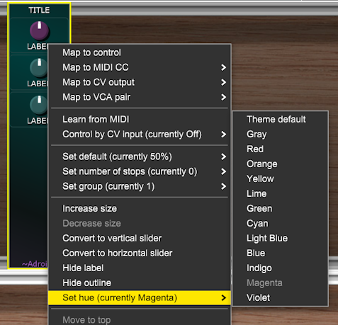
So you can for instance have several different colors of knobs in use at the same time, although you can only override the hue not the saturation or brightness. There are only a small number of preset hues in the menu, but you should still find this feature sufficiently flexible in practice. You generally want to minimize the color variation in an interface anyway as it can look garish if there is too much variation. If you look at professional graphic design work you will rarely see more than three distinct colors in use.
If you ever think why when I’m changing the hue on Custom Look is that control on a Custom panel not changing color, it will be because the control will be overriding the hue in its menu setting.
One slight complication is when the saturation or brightness have low settings, in this case the saturation and/or brightness used in Custom Panel might be slightly modified so that there is actually some visible effect of the hue override. This enables you to add some color variation in Custom Panel elements even if the color specified in Custom Look is black, gray or white.
The OUTLINE and TEXT colors also have an ALPHA knob. This sets the transparency. When fully CCW the rounded rectangular outlines and even the regular text labels on Custom Panels are invisible. Fully CW equates to 100% opacity.
The little rounded rectangle at the bottom of the OUTLINE column shows you the effect of the alpha setting on Custom Panel outlines.
You’ll only ever set the TEXT ALPHA knob fully CCW if you have opted to render all the labels as part of a background image.
Gradient Shading
By default Adroit Custom uses a three-color gradient shading system to paint simple but effective backgrounds. There’s an option to use a custom image instead for Custom Panel backgrounds.
The gradient shading system uses the three colors set by the three columns of HUE, SAT, BRIGHT controls shown below.

The SLOPE knob lets you add a slant to the shading and the Y OFFSET knob allows for vertical adjustment.
If you set the SLOPE knob to 12 o’clock the shading is purely vertical rather than slanting. You can set the SLOPE knob to exactly 12 o’clock by double-clicking it. One advantages of purely vertical shading is that you don’t have to worry about the horizontal index of modules (discussed shortly) because the shading is horizontally uniform.
The SHADOW knob controls how dark the shadows cast by controls are. If set fully CCW no shadows are drawn.
The LINK HUES button restricts the range of color variation if engaged. This helps especially when using the RANDOM button as it constrains the results to something sensible. You can then disengage LINK HUES to manually add a little bit of variation.
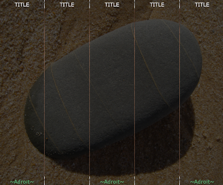
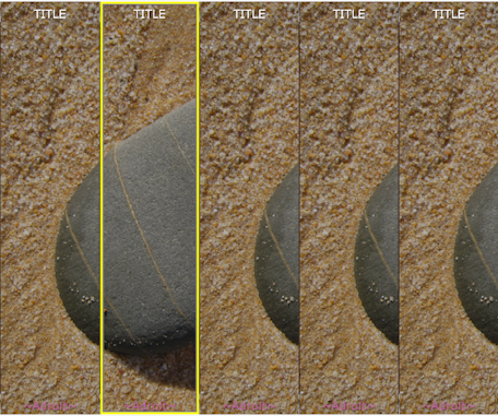
Background Image
Custom Look allows you to load a customized image to use as the background for Custom Panels. Here’s an example using five blank Custom Panel modules…

Note that images can only be used as a background for the Custom Panel modules. The other modules always use gradient shading.
When using an image for Custom Panel backgrounds only one file is required despite it being displayed across however many Custom Panel modules there are in your interface. You don’t have to chop it up into lots of sub-images – a task that would be very time-consuming, especially if repeated changes are made to your background image.
Note if you just want to display a relatively small image such as a logo then you might be better off using the Graphic element in Custom Panel to overlay the image on top of a gradient shaded background.
The same background image is shared between themes but the brightness set by the BRIGHT knob can be different in each theme. So for instance when using the Dark theme the brightness might be turned down so much that the image is almost black.
To load an image file click on the LOAD button. This launches a standard file selector. PNG, JPEG, GIF and BMP formats are supported. PNG is probably the best option but any will work fine.
Once loaded the file is no longer required by Adroit Custom as the image data is saved in the Voltage Modular preset, but you should keep the original image file in case you need to make any changes in the future.
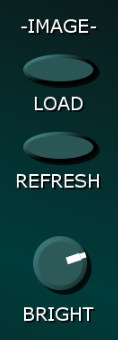
After a successful load the LOAD button changes function and is re-labelled as a REMOVE button. Click on this if you want to revert to gradient shading.
If you edit the background image file you can reload it by clicking on the REFRESH button. Or you can click on REMOVE and then load the same or a different file manually by clicking on LOAD.
If you add a new Custom Panel module when the background is an image you will need to click on the REFRESH button to get it to use the image.
As already mentioned the BRIGHT knob controls the brightness of the image and each theme has its own setting.
It’s difficult to pre-judge how bright the background image needs to be to contrast with the elements superimposed on it, so the knob is very useful for making instant adjustments without you having to manipulate the image in a graphics editor.
A CONTRAST knob might be added in a future update.
Each Custom Panel module is 86 pixels wide by 360 pixels high when Voltage Modular’s magnification is set to 100%. However, the internal graphics system used by Adroit Custom works at twice this resolution so that everything still looks good when magnified. Therefore from the point of view of background images Custom Panels are 172 pixels wide by 720 pixels high.
So if your custom interface consists of say four Custom Panel modules in a horizontal row the background image should be 688 pixels wide by 720 pixels high. If your custom interface spans three cabinets with each cabinet containing ten Custom Panel modules then your background image should be 1720 pixels wide by 2160 pixels high. It’s just a matter of multiplying the number of modules by either 172 or 720.
To save you having to use a calculator here are some common widths you might need…
| 1 | 2 | 3 | 4 | 5 | 6 | 7 | 8 | 9 | 10 | 11 | 12 |
| 172 | 344 | 516 | 688 | 860 | 1032 | 1204 | 1376 | 1548 | 1720 | 1892 | 2064 |
And common heights…
| 1 | 2 | 3 | 4 | 5 |
| 720 | 1440 | 2160 | 2880 | 3600 |
Nothing terrible will happen if the image file is the wrong size. It just won’t match up properly.
If you use an image that is less than 172 pixels wide or less than 720 pixels high then it will be stretched to 172 by 720 automatically. One benefit of this is that you can use an image that’s just a single pixel wide and it will turn into a vertical gradient. A simple trick is to use a graphics editor to cut out a section of a photo or other image that you like the color spectrum of, resize it to 1 pixel wide by 720 pixels high and use it as a background image.
The background image file shouldn’t contain any transparency information but if it does it’s not a problem – the image will be rendered as if the background layer was black.
If Custom Panels are currently using an image for their backgrounds then the button at the top of the Background Image column will be labelled REMOVE. If you click on this button the Custom Panels will switch to using gradient shading and the button will be re-labelled to LOAD.
In other words a single button labelled either LOAD or REMOVE switches the Custom Panels between using either a custom image or gradient shading.
Horizontal and Vertical Indices
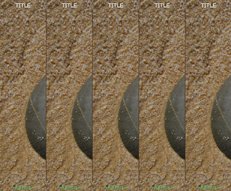
Whether you use gradient shading or an image, as your interface will almost always consist of more than one Custom Panel module, there is the problem of mapping the background to these modules.
Unfortunately (for the moment at least) Voltage Modular provides no mechanism for a module to discover its position in a patch so each Custom Panel module has a Horizontal index setting and a Vertical Index setting in their main menu. These indicate where the module is relative to its neighbours.

If all your Custom Panel modules have their default Horizontal index and Vertical index settings of 1 then they will all display the same part of the background image or an identical gradient shading pattern.
If you use gradient shading and the SLOPE knob is set at 12 o’clock then the shading will look fine no matter what the horizontal index is.
The horizontal and vertical indices also affect whether the ~Adroit~ logo is displayed. Rather than plastering the logo on every single module, it’s not displayed if the horizontal index is an even number. Although if the vertical index is an even number the pattern is inverted. The idea is that if the indices are set correctly you should end up with a checker board pattern.
Manually setting the horizontal and vertical indicies on a large number of Custom Panel modules can be very tedious work so there is a shortcut that uses Adroit Custom’s cloning mechanism…
For each cabinet make sure that the left-most Custom Panel module has the correct horizontal and vertical index and make sure that the module is selected (so that it has a yellow rectangle around its boundary).
Hold down the CTRL (or ⌘) key and press C. This copies all of the information about the module to the cloning clipboard. Then, keeping the CTRL (or ⌘) key held down all the while, click on the next module to the right and press V. This copies the info from the clipboard to the module and it automatically increments the horizontal index.
If the first module has no elements or the subsequent modules already contain elements then no cloning happens, only the horizontal and vertical indices are changed.
Now, still keeping the CTRL (or ⌘) key held down, click on the next module to the right and press V again. Repeat this until you get to the end of the row then release the CTRL (or ⌘) key. With a little practice you should be able to do this pretty quickly and without error, so if you rearrange your interface (perhaps by inserting a new panel) you can set all the panel indices to be correct without it being a nightmare task.
Background Image Optimization
When your patch is saved the individual Custom Panel modules automatically chop out the bit of the background image they are assigned by their Horizontal index and Vertical index settings in order to save what might be many megabytes of space. Lossless compresssion is used but you still don’t want every Custom Panel module to store its own copy of the entire background as the Voltage Modular preset file could end up being enormous.
The downside is that after this optimization happens you can no longer change the horizontal and vertical indices (because each module now only has its own bit of the background available) but providing that the original image file is still in place all you need to do is click the REFRESH button to reverse this optimization so that you can change the index settings. Alternatively you can reload the file using the LOAD button and this will also unlock the index settings too.
The path to the original image file is saved inside the Voltage Modular preset but if it becomes no longer valid for any reason it’s just ignored.
Being able to use custom background images is something that is often requested by users but if you don’t have graphics design experience then you should expect it to be a challenge. Getting it right is not as straightforward as one might think.
Styles
The knob, slider, button, joystick, LED and scope sections each have a STYLE button.

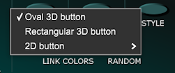
If you click on the knob STYLE button the following menu will pop up.

You can freely change the hue, saturation and brightness of knobs and you can select various subtle variations in detail but at the moment there are broadly four different types of knob available as shown below.

Clicking on the slider STYLE button produces the following menu.

As with the knob styles you can freely change the hue, saturation and brightness of knobs and there are subtle variations available but at present there are broadly three different types of slider available as shown below.
Clicking on the button STYLE button produces the following menu.
At the moment there are only two styles available for the joystick, LED and scope elements so their STYLE buttons toggle between the two states rather than launch menus. But eventually they will probably launch menus too.
When combined with different hue, saturation and brightness settings and the sub-categories the range of skins in reasonably wide but further styles are planned for inclusion in future updates. Please get in touch by email or on the forum if you have any specific suggestions.